Icon font libraries
PurgeTSS ships with four official icon font families, each preconfigured with the TSS classes and fontFamily mappings you need to drop icons into Buttons, Labels, and TextFields.
- Font Awesome 7 Free (upgrade with
purgetss il -v=fa) - Framework 7 Icons
- Material Icons
- Material Symbols
Older versions of PurgeTSS bundled additional libraries (Bootstrap Icons, Boxicons, LineIcons, Tabler Icons). They were removed to make maintenance easier, but you can recreate them at the bottom of this page.
Icon families reference
Each family ships one or more variant classes, each pointing to a specific font file. Combine a variant class with an icon class to render a glyph. For example, msr ms-home uses the Material Symbols Rounded font with the home icon.
| Family | Variant | Class | fontFamily |
|---|---|---|---|
| Material Symbols | Outlined (default) | .ms | MaterialSymbolsOutlined-Regular |
| Material Symbols | Outlined (alias) | .mso | MaterialSymbolsOutlined-Regular |
| Material Symbols | Rounded | .msr | MaterialSymbolsRounded-Regular |
| Material Symbols | Sharp | .mss | MaterialSymbolsSharp-Regular |
| Font Awesome | Solid (default) | .fa | FontAwesome7Free-Solid |
| Font Awesome | Solid (alias) | .fas | FontAwesome7Free-Solid |
| Font Awesome | Regular | .far | FontAwesome7Free-Regular |
| Font Awesome | Brands | .fab | FontAwesome7Brands-Regular |
| Material Icons | Regular | .mi | MaterialIcons-Regular |
| Framework 7 | Regular | .f7 | Framework7-Icons |
Across a family, the icon class is shared by every variant. For Material Symbols, there is one ms-home class; pair it with .ms, .mso, .msr, or .mss to pick the shape (outlined, rounded, or sharp). FontAwesome works the same way: fa-home pairs with .fa/.fas (Solid) or .far (Regular), while brand icons like fa-github need .fab. The variant class chooses the font file. The icon class chooses the glyph.
Full class lists
The complete class definitions live in the PurgeTSS dist/ folder:
Installing the icon fonts
Run icon-library to copy the .ttf files into ./app/assets/fonts/. That is the only step you need. Once the fonts are in place, the icon classes from the table above work out of the box.
# All four families
$ purgetss icon-library

# Selective install
$ purgetss il -v=fa,mi,ms,f7
.tss files in ./purgetss/styles/PurgeTSS already knows every official icon class and resolves them at compile time from its own bundled dist/ files. You do not need fontawesome.tss, materialsymbols.tss, materialicons.tss, or framework7icons.tss inside ./purgetss/styles/ for class="fas fa-home" (or any other icon class) to work in your XML and controllers. Install the .ttf files with icon-library and the classes are ready.
The resolved classes are written to the generated app/styles/app.tss, not to purgetss/styles/utilities.tss. If you go looking for a class like .ms-home, check app.tss.
Optional flags
Two optional flags adjust what icon-library copies into your project:
-s, --styles: copies the official.tsssource files into./purgetss/styles/for reference only. Useful if you want to grep the full class list, see how a class is defined, or override a specific class in your own project.-m, --module: copies the matching CommonJS module into./app/lib/, which exposes each icon's Unicode string to JavaScript. Handy when you setlabel.textfrom a controller and prefer a friendly name likeicons.fa.homeover a raw\uf015.
# Add either flag when you want them
$ purgetss il -s
$ purgetss il -m
$ purgetss il -m -s
Using icons in XML
The variant class sets the fontFamily. The icon class sets the glyph (text / title). Apply both together:
<Alloy>
  <Window>
    <View class="grid">
      <View class="vertical mx-auto grid-cols-2 gap-y-2">
        <!-- Material Symbols variants -->
        <Label class="mt-2 text-gray-700" text="Material Symbols" />
        <Button class="ms ms-home my-1 h-10 w-10 text-xl text-blue-500" />
        <Button class="msr ms-home my-1 h-10 w-10 text-xl text-blue-500" />
        <Button class="mss ms-home my-1 h-10 w-10 text-xl text-blue-500" />
      </View>

      <View class="vertical mx-auto grid-cols-2 gap-y-2">
        <!-- FontAwesome variants -->
        <Label class="mt-2 text-gray-700" text="Font Awesome" />
        <Button class="fas fa-home my-1 h-10 w-10 text-xl text-blue-500" />
        <Button class="far fa-bell my-1 h-10 w-10 text-xl text-blue-500" />
        <Button class="fab fa-github my-1 h-10 w-10 text-xl text-blue-500" />
      </View>
    </View>
  </Window>
</Alloy>
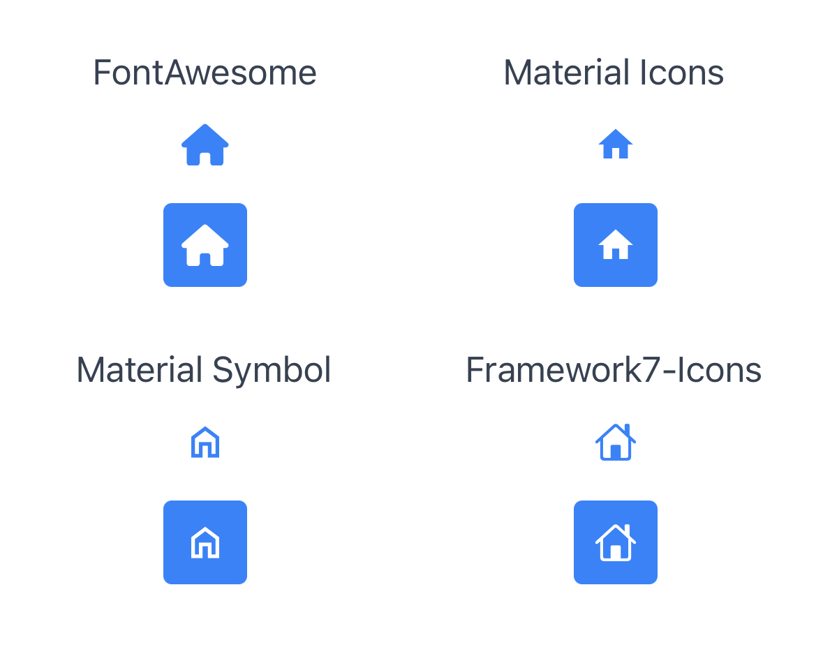
Complete example with all four families
A side-by-side example using all four official families.
To use this file:
- Copy the content of
index.xmlinto a new Alloy project. - Install the official icon font files using
purgetss icon-library.- Without
--vendor, PurgeTSS copies all official icon fonts.
- Without
- Run
purgetssonce to generate the required files. - Compile your app as usual.
- Use
liveviewif you want faster testing.
<Alloy>
  <Window>
    <View class="grid">
      <View class="vertical mx-auto grid-cols-2 gap-y-2">
        <!-- FontAwesome -->
        <Label class="mt-2 text-gray-700" text="FontAwesome" />
        <Button class="fa fa-home my-1 h-10 w-10 text-xl text-blue-500" />
        <Button class="fa fa-home my-1 h-10 w-10 rounded bg-blue-500 text-xl text-white" />
      </View>

      <View class="vertical mx-auto grid-cols-2 gap-y-2">
        <!-- Material Icons -->
        <Label class="mt-2 text-gray-700" text="Material Icons" />
        <Button class="mi mi-home my-1 h-10 w-10 text-xl text-blue-500" />
        <Button class="mi mi-home my-1 h-10 w-10 rounded bg-blue-500 text-xl text-white" />
      </View>

      <View class="vertical mx-auto grid-cols-2 gap-y-2">
        <!-- Material Symbol -->
        <Label class="mt-2 text-gray-700" text="Material Symbol" />
        <Button class="ms ms-home my-1 h-10 w-10 text-xl text-blue-500" />
        <Button class="ms ms-home my-1 h-10 w-10 rounded bg-blue-500 text-xl text-white" />
      </View>

      <View class="vertical mx-auto grid-cols-2 gap-y-2">
        <!-- Framework7-Icons -->
        <Label class="mt-2 text-gray-700" text="Framework7-Icons" />
        <Button class="f7 f7-house my-1 h-10 w-10 text-xl text-blue-500" />
        <Button class="f7 f7-house my-1 h-10 w-10 rounded bg-blue-500 text-xl text-white" />
      </View>
    </View>
  </Window>
</Alloy>
// PurgeTSS v7.10.2
// Created by César Estrada
// https://purgetss.com

/* Ti Elements */
'View': { width: Ti.UI.SIZE, height: Ti.UI.SIZE }
'Window': { backgroundColor: '#FFFFFF' }

/* Main Styles */
'.bg-blue-500': { backgroundColor: '#3b82f6' }
'.gap-y-2': { top: 8, bottom: 8 }
'.grid': { layout: 'horizontal', width: '100%' }
'.grid-cols-2': { width: '50%' }
'.h-10': { height: 40 }
'.mt-2': { top: 8 }
'.mx-auto': { right: null, left: null }
'.my-1': { top: 4, bottom: 4 }
'.rounded': { borderRadius: 4 }
'.text-blue-500': { color: '#3b82f6', textColor: '#3b82f6' }
'.text-gray-700': { color: '#374151', textColor: '#374151' }
'.text-white': { color: '#ffffff', textColor: '#ffffff' }
'.text-xl': { font: { fontSize: 20 } }
'.vertical': { layout: 'vertical' }
'.w-10': { width: 40 }

/* Default Font Awesome */
'.fa': { font: { fontFamily: 'FontAwesome7Free-Solid' } }
'.fa-home': { text: '\uf015', title: '\uf015' }

/* Material Icons */
'.mi': { font: { fontFamily: 'MaterialIcons-Regular' } }
'.mi-home': { text: '\ue88a', title: '\ue88a' }

/* Material Symbols */
'.ms': { font: { fontFamily: 'MaterialSymbolsOutlined-Regular' } }
'.ms-home': { text: '\ue88a', title: '\ue88a' }

/* Framework7 */
'.f7': { font: { fontFamily: 'Framework7-Icons' } }
'.f7-house': { text: 'house', title: 'house' }
Customizing Font Awesome
If you have a Font Awesome Pro account or want to try the Beta, PurgeTSS can generate a custom ./purgetss/styles/fontawesome.tss with the Pro or Beta classes.
Font Awesome Pro
After setting the @fortawesome scope with your token, install it in your project's root folder with npm init and npm install --save-dev @fortawesome/fontawesome-pro (current version 7.1.0).
To generate a new purgetss/styles/fontawesome.tss, run purgetss build. It also copies the Pro font files into ./app/assets/fonts if needed.
Note: Titanium cannot use Font Awesome duotone icons because each icon uses two glyphs.
Font Awesome 7 Beta
To generate a custom fontawesome.tss file from Font Awesome 7 Beta:
Move the "css" and "webfonts" folders from "fontawesome-pro-7.0.0-beta3-web/":
fontawesome-pro-7.0.0-beta3-web
└─ css
└─ webfonts
Into ./purgetss/fontawesome-beta:
purgetss
└─ fontawesome-beta
   ├─ css
   └─ webfonts
Then run purgetss build to generate your custom fontawesome.tss file and test the new icons.
Recreating removed icon libraries
Older versions of PurgeTSS bundled Bootstrap Icons, Boxicons, LineIcons, and Tabler Icons. The list was trimmed to make maintenance easier, but you can rebuild any of them:
- Download the library from its official site:
- Place the
.ttf/.otfand.cssfiles into./purgetss/fonts/<library>/. - Run
purgetss build-fonts.
For the underlying mechanics (how build-fonts reads the .css, options like -m and -f), see Custom fonts.