Grid system
The grid system is a small layout tool that lets you build rows and columns with utility classes.
The snippet below shows the simplest layout. From there, you can mix columns and rows as needed.
<Alloy>
  <View class='grid'>
    <View class="grid-cols-4">
      <!-- Remove this if you don't need a gutter between columns or rows -->
      <View class="gap-1">
        <!-- Content goes here -->
      </View>
    </View>

    <View class="grid-cols-4">
      <!-- Remove this if you don't need a gutter between columns or rows -->
      <View class="gap-1">
        <!-- Content goes here -->
      </View>
    </View>
    ...
    ...
    ...
  </View>
</Alloy>
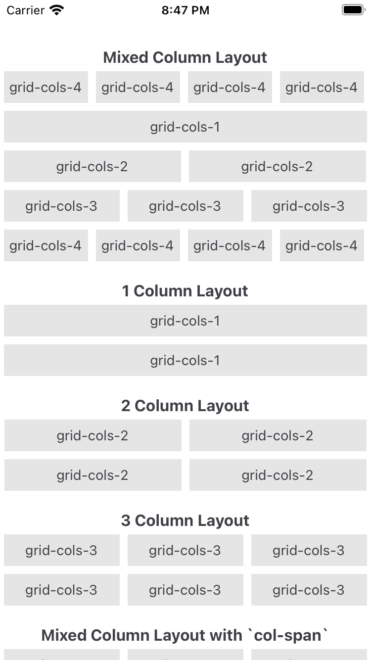
Column grid
grid-cols-{n}
Use grid-cols to set how many columns fit in each row. For example, .grid-cols-2 fits two views per row, .grid-cols-3 fits three, and so on.
col-span-{n}
Use col-span to set how many columns an element occupies in a 12-column grid.
If a view uses .col-span-3, you can add three more views of the same width to fill the row. Other combos like 3-6-3 or 2-4-6 work too, as long as the total is 12.
Row grid
grid-rows-{n}
Use grid-rows to set how many rows fit in each column. For example, .grid-rows-2 fits two views per column, .grid-rows-3 fits three, and so on.
row-span-{n}
Use row-span to set how many rows an element occupies in a 12-row grid.
If a view uses .row-span-3, you can add three more views of the same height to fill the column. Other combos like 3-6-3 or 2-4-6 work too, as long as the total is 12.
Available utilities
These are the available utilities to control "The Grid".
Gutter utilities
gap-{size}: Use this to change the gap between rows and columns.gap-x-{size}andgap-y-{size}: Use these to change the gap between rows and columns independently.gap-{side}-{size}: Use this to change the gap between rows and columns on a specific side (t=top, r=right, b=bottom, l=left).
Column span utilities
- Use
col-span-{n}to make an element span n columns.
Row span utilities
- Use
row-span-{n}to make an element span n rows.
Direction utilities
gridorgrid-flow-col: Use these utilities to set the layout property to horizontal.grid-flow-row: Use this utility to set thelayoutproperty tovertical.
Column utilities
grid-cols-{n}: Use this utility to create grids with n equally sized columns.
Row utilities
- Use
grid-rows-{n}to create grids with n equally sized rows.
Row placement utilities
start: Aligns an element to the start of a row.end: Aligns an element to the end of a row.center: Aligns an element to the center of a row.