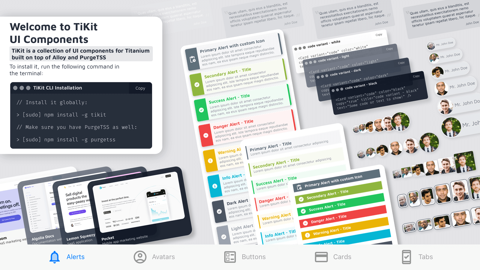
Welcome to TiKit UI Components


Building consistent UIs in Titanium SDK can feel repetitive. TiKit is a small library of UI components built with Alloy and PurgeTSS to cut down that work. It gives you reusable building blocks for common UI patterns, so you can spend more time on the parts of your app that are actually unique.
TiKit is meant to help you move faster without fighting styling details.
Why TiKit
- Alerts, Avatars, Buttons, Cards, and Tabs with practical defaults.
- Styled with PurgeTSS utility classes instead of large TSS files.
- Dynamic updates -- change text, images, and icons without recreating the component.
- Works with FontAwesome, Material Icons, and other icon fonts.
- Customizable colors and styles via
classesproperty. - You only pass what you need.
Getting Started
First, install the TiKit CLI:
# Might need 'sudo' depending on your setup
npm install -g tikit
Make sure you also have PurgeTSS installed globally:
# Might need 'sudo' here too
npm install -g purgetss
Setting Up Your Project
-
Create a PurgeTSS project. If you haven't already, create a new Alloy project using PurgeTSS. Make sure you've configured the
app.idprefixandapp.themesettings as required by PurgeTSS:purgetss create myApp# Follow the prompts -
Install TiKit components. Go into your new project directory (
cd myApp) and run the TiKit installer. It guides you through picking the components you want:tikit install# ? Choose a component to install › - Use arrow-keys. Return to submit.# ❯ all components# alerts# avatars# buttons# cards
Component Default Values
TiKit components work out of the box with sensible defaults. Here's what each primary component uses when a property isn't specified:
| Component | Property | Default Value | Description |
|---|---|---|---|
| Alerts | color | "dark" | The alert's color scheme |
variant | "pop" (with text) or "solid" (without text) | The alert's visual style | |
| Avatars | size | "base" | The avatar's size |
variant | "chip" (with name) or "square" (without name) | The avatar's shape and style | |
| Buttons | size | "base" | The button's size |
variant | "icon-left" (with icon) or "filled" (without icon) | The button's visual style | |
| Cards | color | "dark" | The card's color scheme |
variant | "showcase" (with image) or "content" (with subtitle) or "code" (default) | The card's layout style |
That means you can use components with minimal properties:
<!-- Uses variant="pop", color="dark" by default -->
<Alert module="tikit.ui" title="Simple Alert" text="With default values" />

<!-- Uses variant="square", size="base" by default -->
<Avatar module="tikit.ui" image="path/to/image.jpg" />

<!-- Uses variant="filled", size="base" by default -->
<Button module="tikit.ui" title="Default Button" />

<!-- Uses variant="code", color="dark" by default -->
<Card module="tikit.ui" title="Simple Card" text="Using defaults" />

<!-- Uses variant="content" when subtitle is provided -->
<Card module="tikit.ui" title="Card with Subtitle" subtitle="Important info" text="Some details" />

<!-- Uses variant="showcase" when image is provided -->
<Card module="tikit.ui" title="Image Card" text="With an image" image="path/to/image.jpg" />
Components
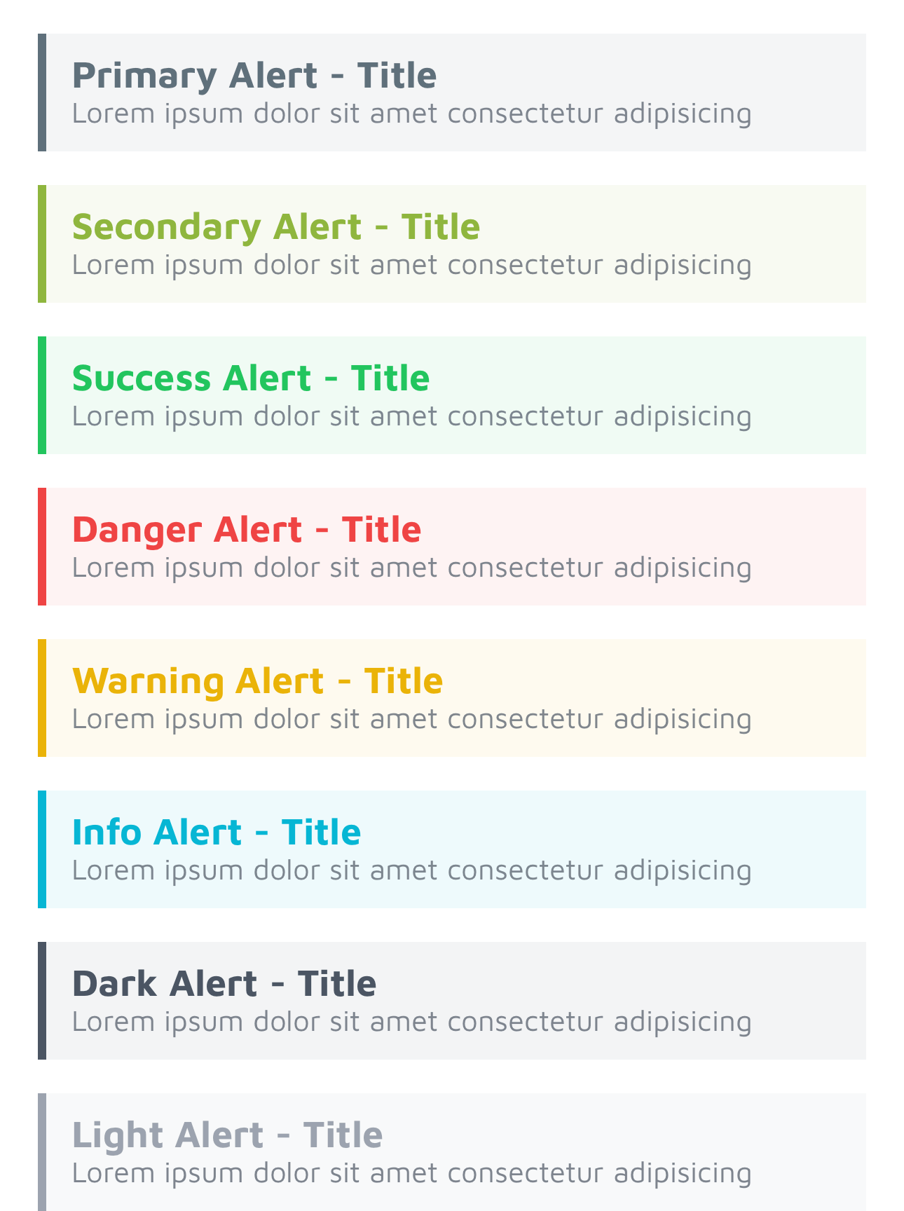
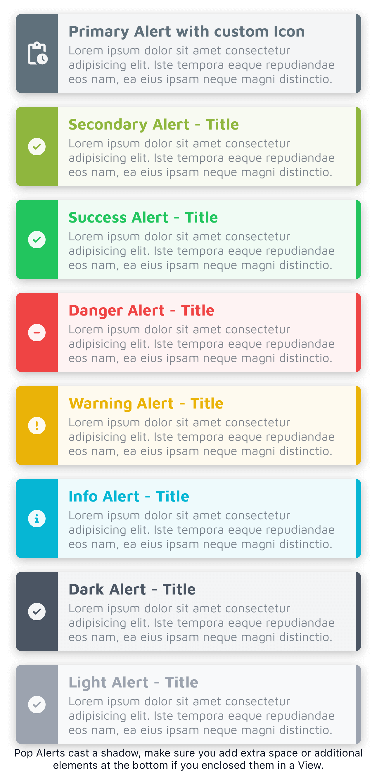
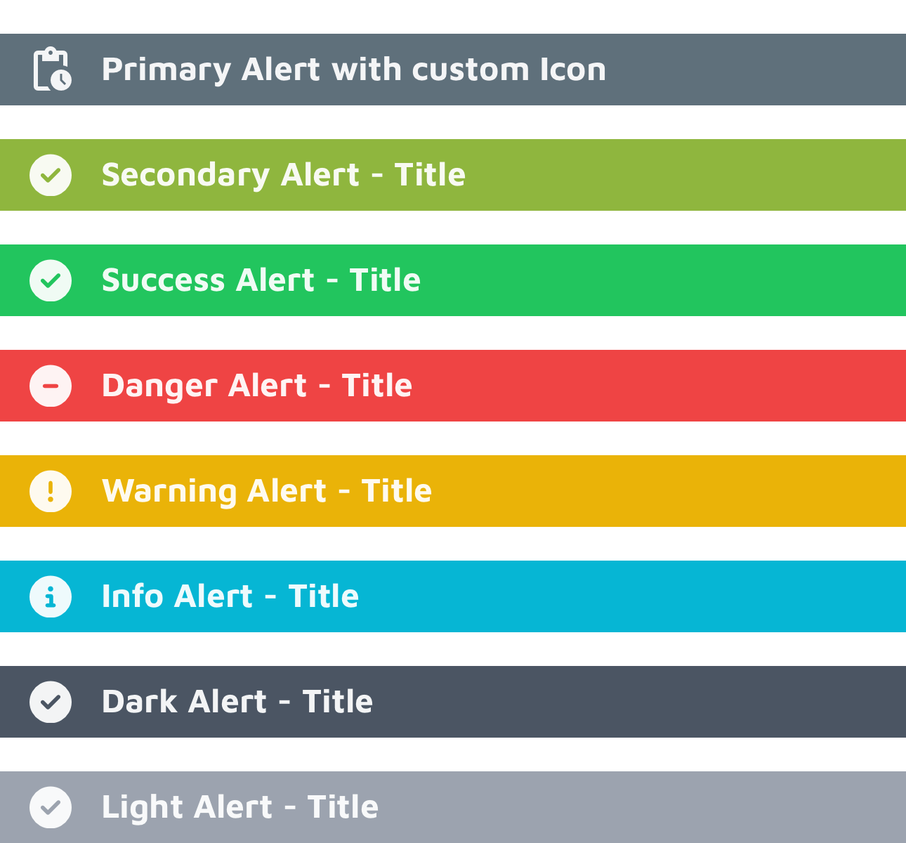
Alerts
Common properties:
variant,color,classes,title,text
Alerts are for short, important messages that don't block the user.
TiKit Alert variants:
callout: Simple message with title and text.pop: Includes an icon alongside the title and text.solid: A full-width banner style, usually with just a title and icon.
Colors: Each variant comes in success, danger, warning, info, dark, and light. You can also define primary and secondary custom colors using PurgeTSS:
# Define your brand colors
purgetss shades '#yourHexCode1' primary
purgetss shades '#yourHexCode2' secondary
Extra controls:
delay(milliseconds): Wait before showing the alert.duration(milliseconds): Control the animation speed.dismissible(boolean): Set totrueto let users tap/click the alert to close it.
<Alert module="tikit.ui" variant="pop" color="info" delay="500" dismissible="true" title="Just FYI" text="You can tap this alert to close it." />
callout
Properties:
title,text
A basic alert for straightforward messages.
<Alert module="tikit.ui" variant="callout" color="success" title="Success!" text="Your changes have been saved." />
pop
Properties:
title,text,icon
Adds a visual cue with an icon. You can customize the icon and its size using PurgeTSS classes in the icon property.
<Alert module="tikit.ui" variant="pop" color="primary" title="Action Required" text="Please review the details." icon="mi mi-pending_actions text-3xl" />
solid
Properties:
title,icon
A full-width banner. Customize the icon just like the pop variant.
<Alert module="tikit.ui" variant="solid" color="warning" title="Maintenance Soon" icon="mi mi-warning text-2xl" />
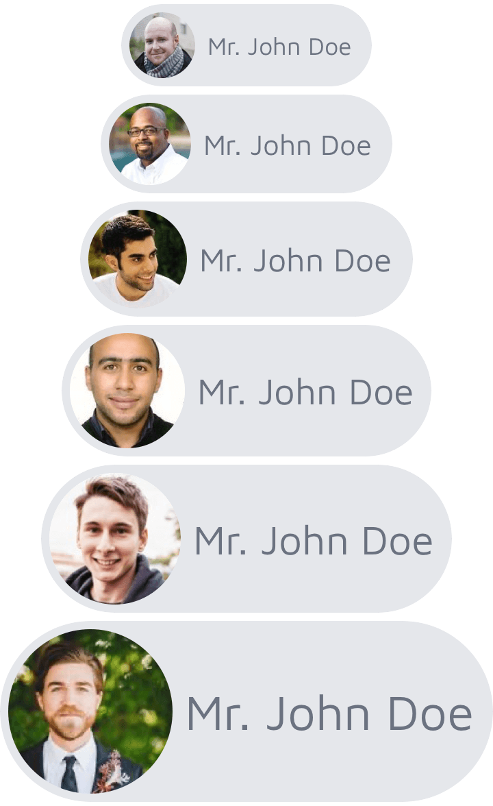
Avatars
Common properties:
variant,size,classes,image
Avatars represent users or objects visually.
TiKit Avatar variants:
chip: Image with a name label next to it.circular: Standard round avatar.landscape: Rectangular, wider than tall.portrait: Rectangular, taller than wide.square: Simple square avatar.stacked: Designed to overlap slightly in a horizontal group.
Sizes: xs, sm, base, lg, xl, and 2xl.
<Avatar module="tikit.ui" variant="circular" size="lg" image="path/to/your/image.jpg" />
chip
Properties:
name,image
Shows an image and a name. Good for lists or mentions. Default background/text is gray, but you can change it with classes.
<Avatar module="tikit.ui" variant="chip" size="base" name="Jane Doe" image="https://randomuser.me/api/portraits/women/86.jpg" classes="bg-blue-100 text-blue-800" />
circular and square
Properties:
name(optional, for accessibility),image,border(boolean)
Classic avatar shapes. Set border="true" for a default white border. Customize the border color using classes (for example, border-blue-500).
<Avatar module="tikit.ui" variant="circular" size="base" border="true" image="https://randomuser.me/api/portraits/men/86.jpg" classes="border-gray-300" />


portrait and landscape
Properties:
name(optional),image
Rectangular avatars with a default gray border (border-gray-500). Override it using classes.
<Avatar module="tikit.ui" variant="portrait" size="base" image="https://randomuser.me/api/portraits/men/87.jpg" classes="border-green-500" />


stacked
Properties:
image,last(boolean)
Use these inside a <View class="horizontal"> to create an overlapping stack. Set last="true" on the final avatar in the stack to fix its right margin.
<View class="horizontal">
  <Avatar module="tikit.ui" variant="stacked" size="base" image="https://randomuser.me/api/portraits/men/86.jpg" />
  <Avatar module="tikit.ui" variant="stacked" size="base" image="https://randomuser.me/api/portraits/women/87.jpg" />
  <Avatar module="tikit.ui" variant="stacked" size="base" image="https://randomuser.me/api/portraits/men/62.jpg" />
  <Avatar module="tikit.ui" variant="stacked" size="base" last="true" image="https://randomuser.me/api/portraits/women/88.jpg" />
</View>

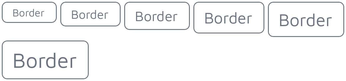
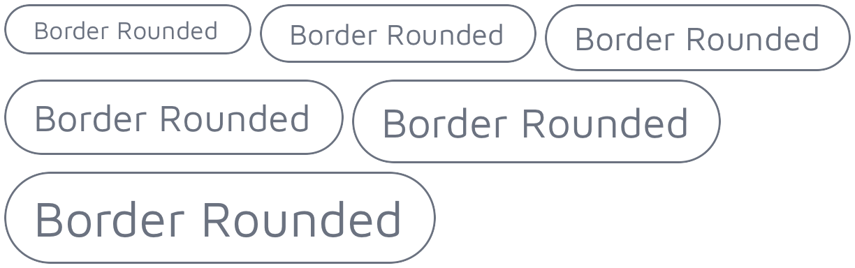
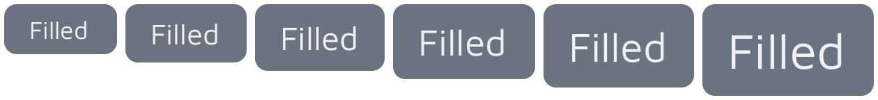
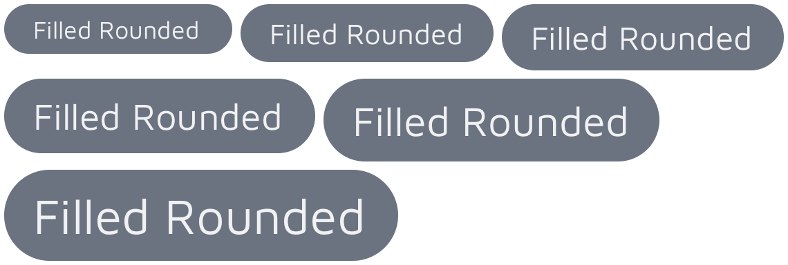
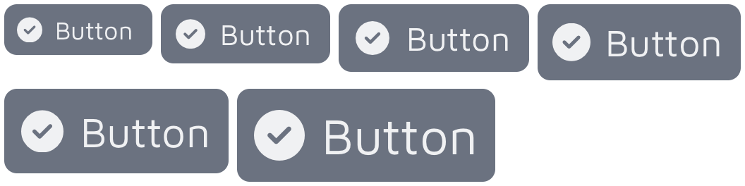
Buttons
Common properties:
variant,size,classes,title
Buttons are for user actions and choices.
TiKit Button variants:
border: Text with an outline border.border-rounded: Likeborder, but with rounded corners.filled: Solid background color with text.filled-rounded: Likefilled, but with rounded corners.icon-left: Icon on the left, text on the right.icon-right: Text on the left, icon on the right.
Sizes: xs, sm, base, lg, xl, and 2xl.
<Button module="tikit.ui" variant="filled" size="lg" title="Submit" classes="bg-blue-500 text-white" />
border and border-rounded
Property:
title
Outlined buttons. Use classes to control the border and text color (for example, border-purple-500 text-purple-500).
<Button module="tikit.ui" variant="border" size="base" title="Cancel" classes="border-red-500 text-red-500" />
filled and filled-rounded
Property:
title
Solid background buttons. Use classes to set background and text colors (for example, bg-green-600 text-white).
<Button module="tikit.ui" variant="filled-rounded" size="base" title="Confirm" classes="bg-green-600 text-white" />
icon-left and icon-right
Properties:
title,icon
Buttons with text and an icon. Use the icon property to specify the icon class (for example, fa fa-save) and classes for background/text colors.
<Button module="tikit.ui" variant="icon-left" size="base" title="Save" icon="fa fa-save text-white" classes="bg-blue-500 text-white" />
Using Custom Icons in Buttons
You can use any icon font loaded through PurgeTSS. Pass the font prefix and icon name in the icon property, along with any size or color classes you need.
<Button module="tikit.ui" variant="icon-right" size="lg" title="Settings" icon="mi mi-settings text-lg text-gray-100" classes="bg-gray-700 text-gray-100" />

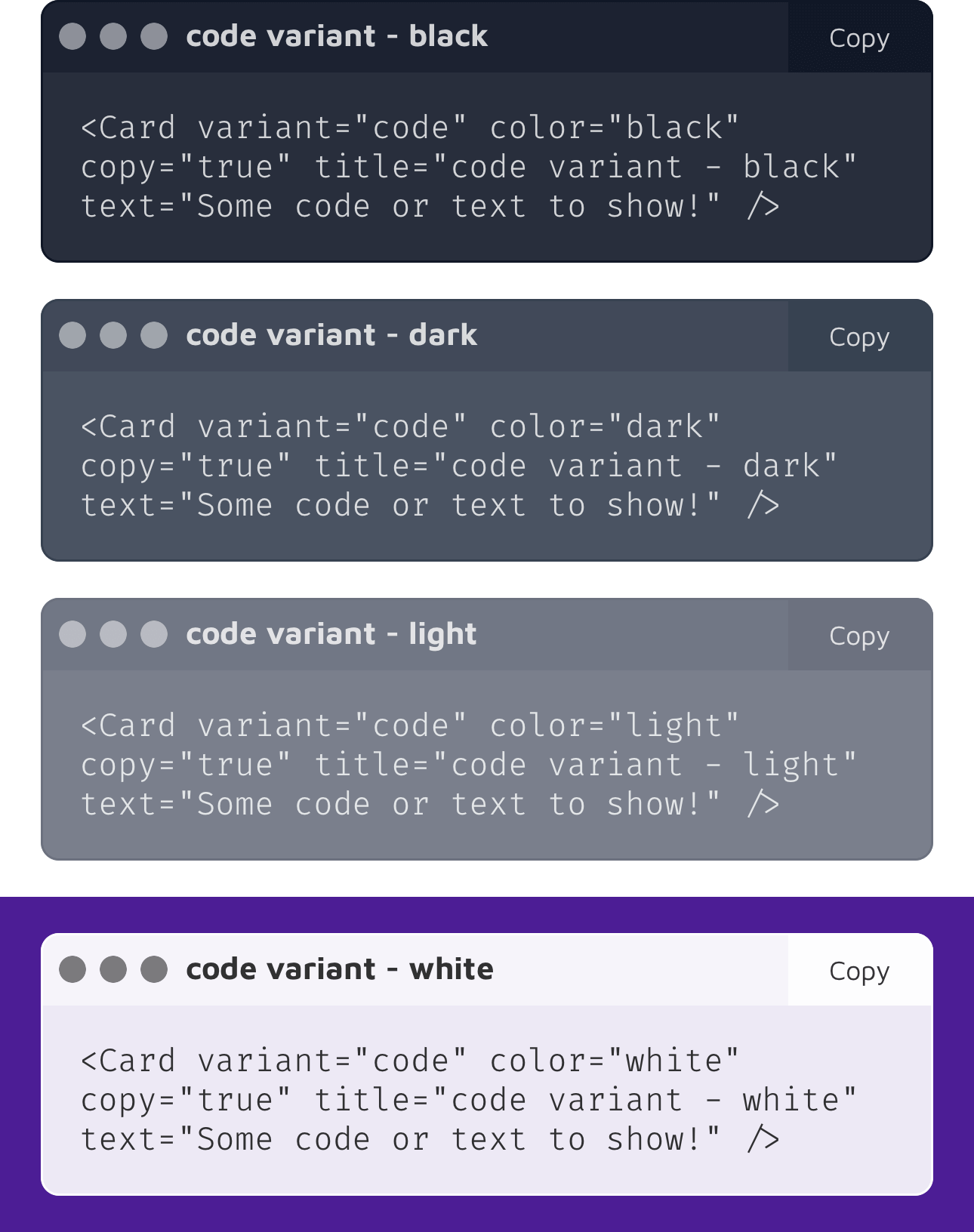
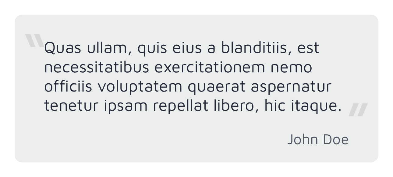
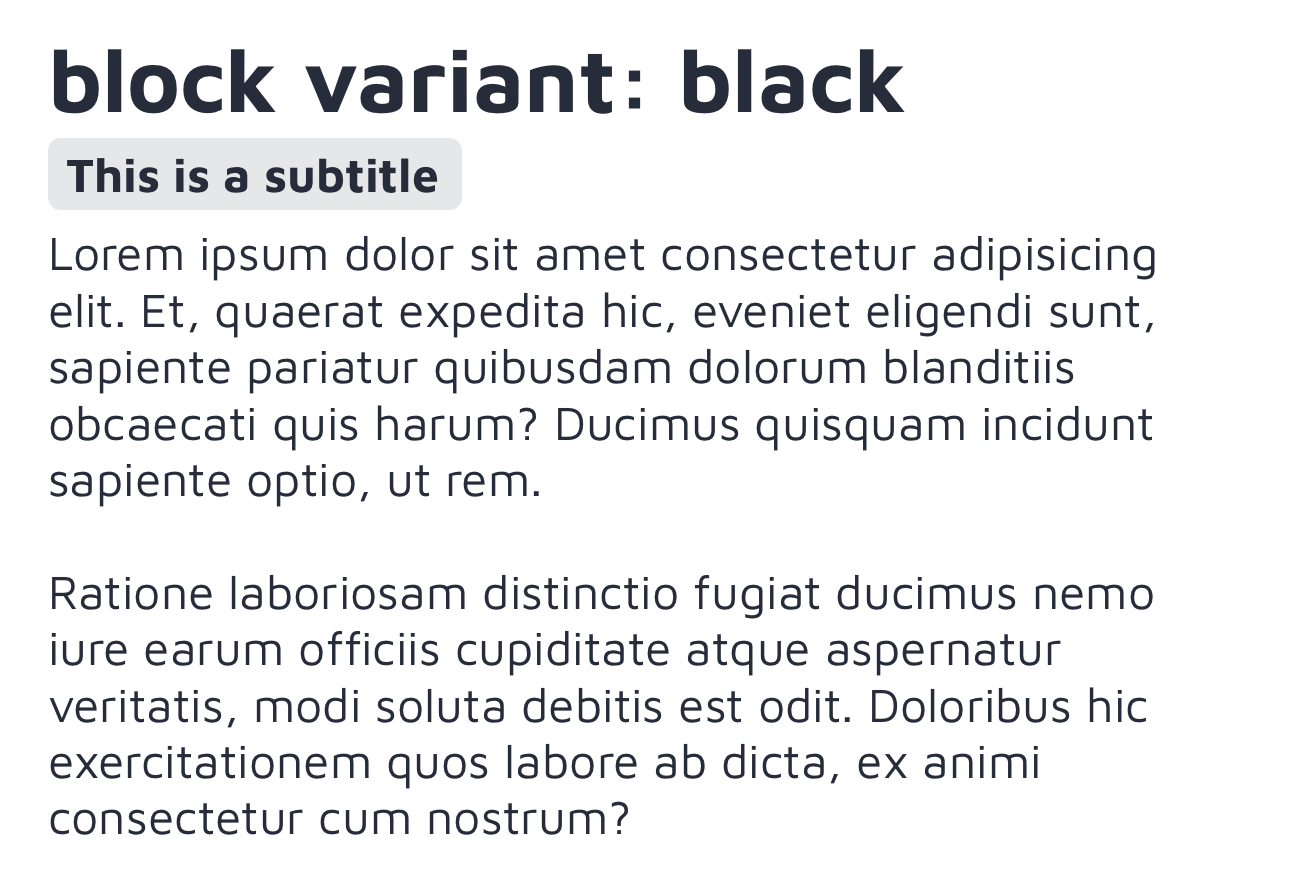
Cards
Common properties:
variant,color,classes
Cards group related content for summaries or showcases.
TiKit Card variants:
code: Display code snippets, with an optional copy button.content: Blocks of text with a main title and highlighted subtitle.quote: A quote with attribution.showcase: An image with a title and description.
Colors: black, dark, light, and white themes that affect background and text colors.
<Card module="tikit.ui" variant="showcase" color="light" title="Featured Item" text="A brief description goes here." image="images/feature.png" />
code
Properties:
title,text,copy(boolean)
Use this for code examples. Set copy="true" to add a copy button.
Pro tip: For best results, install a monospaced font (like Fira Code or JetBrains Mono) and configure font-mono in your PurgeTSS config.
Localization: The copy button uses L('copy', 'Copy') for its title and L('code_copied', 'Code copied!') for the confirmation message. Add these keys to your strings.xml files for translation.
<Card module="tikit.ui" variant="code" color="dark" copy="true" title="Example Function" text="function hello() { console.log('Hi!'); }" />
showcase
Properties:
title,text,image,rounded(integer)
Displays an image with a title and description. The rounded property accepts any integer value (0 or greater) to control the border radius. Use rounded=0 for sharp corners, or increase the value (like rounded=12) for more rounded corners.
<Card module="tikit.ui" variant="showcase" color="black" title="Project X" text="Mobile app design concept." image="images/showcase/project-x.jpg" />

quote
Properties:
name,text
Display a quote attributed to someone.
<Card module="tikit.ui" variant="quote" color="white" name="Jane Austen" text="There is no charm equal to tenderness of heart." />
content
Properties:
title,subtitle,text
Use this for text content with a clear hierarchy: a large title, a highlighted subtitle, and the main body text.
<Card module="tikit.ui" variant="content" color="light" title="About TiKit" subtitle="Making UI Easier" text="TiKit aims to provide useful components..." />
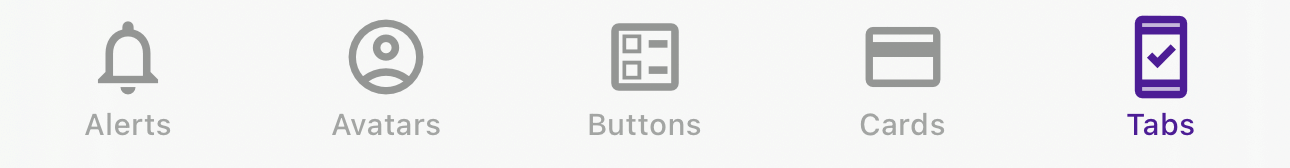
Tabs
Properties:
title,icon,activeIcon(iOS only) plus standardTitanium.UI.Tabproperties
Tabs with icon font support for FontAwesome, Material Icons, and others.
Specify the icon using icon="fa fa-home" or icon="mi mi-settings". On iOS, you can provide a different icon for the active state using activeIcon.
<Tab module="tikit.ui" title="Home" icon="fa fa-home" activeIcon="fas fa-home">
  <Require src="home_window" />
</Tab>
Styling Tabs Further
Because these are Titanium.UI.Tab objects, you can use standard properties and PurgeTSS classes. For example, change the active tint color:
<Tab module="tikit.ui"
     class="active-tint-indigo-600 active-title-indigo-600"
     title="Profile"
     icon="mi mi-person_outline text-3xl"
     activeIcon="mi mi-person text-3xl">
  <Require src="profile_window" />
</Tab>
Updating Components Dynamically
TiKit components do not need to be destroyed and recreated just to change simple things like text or an image. Give the component an id in XML, then call update methods from your controller.
This is useful when you need to:
- Update a Card's text after data loads from an API.
- Change an Avatar image after the user uploads a new photo.
- Modify an Alert message based on user actions.
- Change a Button's title or icon (for example, from "Save" to "Saving..." and back).
Available Update Methods
You can call these on your component's proxy (for example, $.myCard.updateTitle(...)):
updateTitle(newTitle): Changes the main title.updateSubtitle(newSubtitle): Changes the subtitle (mainly for Cards).updateText(newText): Changes the main text content.updateName(newName): Changes the name (useful for Avatarchipvariant).updateImage(newImage): Changes the image (path or blob).updateIcon(newIcon): Changes the icon class string (for Alerts and Buttons).update(args): Shortcut to update multiple properties at once. Pass an object like{ title: 'New', text: 'Updated text' }. Supportstitle,subtitle,text,name,image, andicon.
Which Components Support Updates
- Cards (
<Card>):title,subtitle,text,image(works across variants where applicable). - Avatars (
<Avatar>):image,name(namemostly forchip). - Alerts (
<Alert>):title,text,icon(textnot applicable tosolid). - Buttons (
<Button>):title,icon(iconforicon-left/icon-right).
Example: Updating a Card
View (index.xml):
<Alloy>
  <Window>
    <View class="vertical mx-4 my-8">
      <Card id="statusCard" module="tikit.ui" variant="content" color="light"
            title="Status"
            subtitle="Current"
            text="Waiting for update..." />

      <Button module="tikit.ui" variant="filled" size="base"
              title="Fetch Status" onClick="fetchStatus"
              classes="mt-4 bg-blue-500 text-white" />
    </View>
  </Window>
</Alloy>
Controller (index.js):
function fetchStatus() {
  // Simulate fetching data...
  $.statusCard.update({
      title: 'Status Updated!',
      subtitle: 'Just Now',
      text: 'Everything looks good. System operational.'
  });

  // You could also update individually:
  // $.statusCard.updateTitle('Status Updated!');
  // $.statusCard.updateSubtitle('Just Now');
  // $.statusCard.updateText('Everything looks good...');
}
Working with Icon Fonts
PurgeTSS manages icon fonts for you.
Using Official Icon Fonts
To add popular free icon sets, run:
# Add Font Awesome (fa), Material Icons (mi), Material Symbols (ms), Framework7 (f7)
purgetss icon-library --vendor=fa,mi,ms,f7
This copies the font files and CSS into your project.
Adding Your Own Custom Icon Fonts
If you use a custom icon font, follow these steps:
-
Organize files. Place your font (
.ttfor.otf) and its CSS file, which maps icon names to Unicode characters, in the PurgeTSS fonts directory:YourProject/└── purgetss/└── fonts/└── your-cool-font-name/ <-- Create this folder├── cool-font.css└── cool-font.ttf -
Build fonts. Run the PurgeTSS command:
purgetss build-fontsThis generates the necessary TSS classes in
fonts.tss. -
Use them in TiKit. Now you can use your custom icons like the built-in ones:
<Button module="tikit.ui" variant="icon-left" title="Launch"icon="myicon myicon-rocket text-lg"classes="bg-purple-600 text-white" /><Alert module="tikit.ui" variant="pop" color="info"title="Update Available"icon="myicon myicon-download text-2xl" />
You can mix icons from different libraries throughout your app.
License
TiKit UI Components is open source and shared under the MIT License.
MIT License

Copyright (c) 2023-2025 César Estrada

Permission is hereby granted, free of charge, to any person obtaining a copy
of this software and associated documentation files (the "Software"), to deal
in the Software without restriction, including without limitation the rights
to use, copy, modify, merge, publish, distribute, sublicense, and/or sell
copies of the Software, and to permit persons to whom the Software is
furnished to do so, subject to the following conditions:

The above copyright notice and this permission notice shall be included in all
copies or substantial portions of the Software.

THE SOFTWARE IS PROVIDED "AS IS", WITHOUT WARRANTY OF ANY KIND, EXPRESS OR
IMPLIED, INCLUDING BUT NOT LIMITED TO THE WARRANTIES OF MERCHANTABILITY,
FITNESS FOR A PARTICULAR PURPOSE AND NONINFRINGEMENT. IN NO EVENT SHALL THE
AUTHORS OR COPYRIGHT HOLDERS BE LIABLE FOR ANY CLAIM, DAMAGES OR OTHER
LIABILITY, WHETHER IN AN ACTION OF CONTRACT, TORT OR OTHERWISE, ARISING FROM,
OUT OF OR IN CONNECTION WITH THE SOFTWARE OR THE USE OR OTHER DEALINGS IN THE
SOFTWARE.