Arbitrary values
When you need a one-off value that is not in the defaults, use arbitrary values instead of adding it to config.cjs.
Use parentheses notation with almost any default utility class to generate an arbitrary style.
Square bracket notation is not supported because Titanium already uses brackets for platform and conditional statements in .tss files.
Class syntax pre-validation
Before purging, PurgeTSS scans class names from XML views and JS controllers for common authoring mistakes. When it finds one, it stops with a structured Class Syntax Error block that includes the file, line, offending content, and a concrete Fix: suggestion. If there are multiple errors, PurgeTSS reports them in the same run so you can fix them together.
Five patterns are detected:
| Pattern | Wrong | Right | Reason |
|---|---|---|---|
| Inverted negative sign | top-(-10) | -top-(10) | The - prefix goes before the rule, not inside the value |
| Square brackets | top-[10px] | top-(10px) | PurgeTSS uses parentheses for arbitrary values |
| Empty parentheses | wh-() | wh-(10) | Add a value |
| Whitespace inside parentheses | wh-( 200 ) | wh-(200) | No spaces between ( and the value |
Redundant px unit | top-(10px) | top-(10) | PurgeTSS treats unit-less arbitrary values as pixels |
Generic unknown classes are not flagged by this validator. Typos, custom utilities that are not declared yet, and vendor classes not enabled in config.cjs still flow into the // Unused or unsupported classes comment block in app.tss, as before. The validator only catches narrow, actionable mistakes so it does not add noise while you are still sketching out class names.
Color properties
You can set arbitrary color values with hex, rgb, or rgba values, either in XML files or in config.cjs.
<Alloy>
  <Window class="from-(#4C61E4) to-(#804C61E4)">
    <Label class="w-(250) bg-(rgba(100,200,50)) text-(#4C61E4) text-(15) rounded-4 h-8 text-center" text="Green Label" />
  </Window>
</Alloy>
// PurgeTSS v7.10.2
// Created by César Estrada
// https://purgetss.com

/* Ti Elements */
'Window': { backgroundColor: '#FFFFFF' }

/* Main Styles */
'.h-8': { height: 32 }
'.rounded-4': { borderRadius: 8 }
'.text-center': { textAlign: Ti.UI.TEXT_ALIGNMENT_CENTER }

/* Arbitrary Values */
'.bg-(rgba(100,200,50))': { backgroundColor: 'rgba(100,200,50)' }
'.from-(#4C61E4)': { backgroundGradient: { colors: [ '#004C61E4', '#4C61E4' ] } }
'.text-(#4C61E4)': { color: '#4C61E4', textColor: '#4C61E4' }
'.text-(15)': { font: { fontSize: 15 } }
'.to-(#804C61E4)': { backgroundGradient: { colors: [ '#804C61E4' ] } }
'.w-(250)': { width: 250 }
List of color properties
These color properties accept arbitrary values:
active-tint-(hex-rgb-or-rgba-value)active-title-(hex-rgb-or-rgba-value)badge-(hex-rgb-or-rgba-value)bar-(hex-rgb-or-rgba-value)bg-(hex-rgb-or-rgba-value)bg-focused-(hex-rgb-or-rgba-value)bg-selected-(hex-rgb-or-rgba-value)bg-selected-from-(hex-rgb-or-rgba-value)bg-selected-to-(hex-rgb-or-rgba-value)border-(hex-rgb-or-rgba-value)current-page-indicator-(hex-rgb-or-rgba-value)date-time-(hex-rgb-or-rgba-value)disabled-(hex-rgb-or-rgba-value)drop-shadow-(hex-rgb-or-rgba-value)from-(hex-rgb-or-rgba-value)highlighted-(hex-rgb-or-rgba-value)image-touch-feedback-(hex-rgb-or-rgba-value)indicator-(hex-rgb-or-rgba-value)keyboard-toolbar-(hex-rgb-or-rgba-value)nav-tint-(hex-rgb-or-rgba-value)on-tint-(hex-rgb-or-rgba-value)page-indicator-(hex-rgb-or-rgba-value)paging-control-(hex-rgb-or-rgba-value)placeholder-(hex-rgb-or-rgba-value)pull-bg-(hex-rgb-or-rgba-value)results-bg-(hex-rgb-or-rgba-value)results-separator-(hex-rgb-or-rgba-value)selected-(hex-rgb-or-rgba-value)selected-button-(hex-rgb-or-rgba-value)selected-subtitle-(hex-rgb-or-rgba-value)selected-text-(hex-rgb-or-rgba-value)separator-(hex-rgb-or-rgba-value)shadow-(hex-rgb-or-rgba-value)subtitle-(hex-rgb-or-rgba-value)tabs-bg-(hex-rgb-or-rgba-value)tabs-bg-selected-(hex-rgb-or-rgba-value)text-(hex-rgb-or-rgba-value)thumb-tint-(hex-rgb-or-rgba-value)tint-(hex-rgb-or-rgba-value)title-(hex-rgb-or-rgba-value)title-attributes-(hex-rgb-or-rgba-value)title-attributes-shadow-(hex-rgb-or-rgba-value)title-text-(hex-rgb-or-rgba-value)to-(hex-rgb-or-rgba-value)touch-feedback-(hex-rgb-or-rgba-value)track-tint-(hex-rgb-or-rgba-value)
Spacing properties
You can set arbitrary values for most size and dimension properties with rem, px, or pt, either in XML files or in config.cjs.
<Alloy>
  <Window>
    <Label class="w-(10rem) h-(1.75rem) text-(15) rounded-(5) bg-blue-800 text-center text-white" text="My custom Label" />
  </Window>
</Alloy>
// PurgeTSS v7.10.2
// Created by César Estrada
// https://purgetss.com

/* Ti Elements */
'Window': { backgroundColor: '#FFFFFF' }

/* Main Styles */
'.bg-blue-800': { backgroundColor: '#1e40af' }
'.text-center': { textAlign: Ti.UI.TEXT_ALIGNMENT_CENTER }
'.text-white': { color: '#ffffff', textColor: '#ffffff' }

/* Arbitrary Values */
'.h-(1.75rem)': { height: 28 }
'.rounded-(5)': { borderRadius: 5 }
'.text-(15)': { font: { fontSize: 15 } }
'.w-(10rem)': { width: 160 }
List of spacing properties
- Background padding
bg-padding-b-(any-size-value-and-unit)bg-padding-l-(any-size-value-and-unit)bg-padding-r-(any-size-value-and-unit)bg-padding-t-(any-size-value-and-unit)
- Background left and top cap
bg-l-cap-(any-size-value-and-unit)bg-t-cap-(any-size-value-and-unit)
- Top, right, bottom, left
bottom-(any-size-value-and-unit)left-(any-size-value-and-unit)l-(any-size-value-and-unit)right-(any-size-value-and-unit)r-(any-size-value-and-unit)top-(any-size-value-and-unit)x-(any-size-value-and-unit)y-(any-size-value-and-unit)
- Content width and content height
content-(any-size-value-and-unit)content-h-(any-size-value-and-unit)content-w-(any-size-value-and-unit)
- Gaps (top, right, bottom, left)
gap-(any-size-value-and-unit)gap-b-(any-size-value-and-unit)gap-l-(any-size-value-and-unit)gap-r-(any-size-value-and-unit)gap-t-(any-size-value-and-unit)gap-x-(any-size-value-and-unit)gap-y-(any-size-value-and-unit)
- Width and height
h-(any-size-value-and-unit)w-(any-size-value-and-unit)
indentation-level-(any-size-value-and-unit)keyboard-toolbar-h-(any-size-value-and-unit)- Left and right button padding
left-button-padding-(any-size-value-and-unit)right-button-padding-(any-size-value-and-unit)
- Left and right width
left-w-(any-size-value-and-unit)lw-(any-size-value-and-unit)right-w-(any-size-value-and-unit)rw-(any-size-value-and-unit)
- Margin
m-(any-size-value-and-unit)mb-(any-size-value-and-unit)ml-(any-size-value-and-unit)mr-(any-size-value-and-unit)mt-(any-size-value-and-unit)mx-(any-size-value-and-unit)my-(any-size-value-and-unit)
max-elevation-(any-size-value-and-unit)- Max and min row height
max-row-h-(any-size-value-and-unit)min-row-h-(any-size-value-and-unit)
- Padding
p-(any-size-value-and-unit)pb-(any-size-value-and-unit)pl-(any-size-value-and-unit)pr-(any-size-value-and-unit)pt-(any-size-value-and-unit)px-(any-size-value-and-unit)py-(any-size-value-and-unit)
- paddingTop, paddingRight, paddingBottom, paddingLeft
padding-(any-size-value-and-unit)padding-b-(any-size-value-and-unit)padding-bottom-(any-size-value-and-unit)padding-l-(any-size-value-and-unit)padding-left-(any-size-value-and-unit)padding-r-(any-size-value-and-unit)padding-right-(any-size-value-and-unit)padding-t-(any-size-value-and-unit)padding-top-(any-size-value-and-unit)padding-x-(any-size-value-and-unit)padding-y-(any-size-value-and-unit)
paging-control-h-(any-size-value-and-unit)- Border radius
rounded-(any-size-value-and-unit)rounded-b-(any-size-value-and-unit)rounded-bl-(any-size-value-and-unit)rounded-br-(any-size-value-and-unit)rounded-l-(any-size-value-and-unit)rounded-r-(any-size-value-and-unit)rounded-t-(any-size-value-and-unit)rounded-tl-(any-size-value-and-unit)rounded-tr-(any-size-value-and-unit)
row-h-(any-size-value-and-unit)section-header-top-padding-(any-size-value-and-unit)separator-h-(any-size-value-and-unit)shadow-radius-(any-size-value-and-unit)- xOffset and yOffset
x-offset-(any-size-value-and-unit)y-offset-(any-size-value-and-unit)
Miscellaneous properties
These miscellaneous properties also accept arbitrary values:
List of miscellaneous properties
active-tab-(number-value)border-width-(number-value)cache-size-(number-value)count-down-(in-milliseconds)delay-(in-milliseconds)duration-(in-milliseconds)elevation-(number-value)font-(valid-font-weight-value)horizontal-margin-(decimal-value)lines-(number-value)max-length-(number-value)max-lines-(number-value)max-zoom-scale-(decimal-value)min-zoom-scale-(decimal-value)min-(number-value)minimum-text-(number-value)opacity-(decimal-value-from-0-to-1)origin-(x-and-y-coordinates)paging-control-alpha-(decimal-value-from-0-to-1)paging-control-timeout-(in-milliseconds)repeat-count-(number-value)repeat-(number-value)rotate-(number-value)scale-(decimal-value)text-size-(number-value)timeout-(in-milliseconds)vertical-margin-(decimal-value)z-(number-value)zoom-scale-(decimal-value)
Examples
Use any unit supported by the property you are generating. Use hex or rgba for color properties, and rem or px for position and sizing properties.
Credit card
<Alloy>
  <Window class="bg-(#53606b)">
    <View class="w-(2in) h-(3.5in) bg-(#4C61E4) rounded-(20)">
      <View class="m-(50px) h-screen w-screen">
        <View class="horizontal ml-0 mt-0">
          <View class="w-(3rem) h-(3rem) rounded-(1.5rem) opacity-(0.35) bg-white" />
          <View class="-ml-(20) w-(3rem) h-(3rem) rounded-(1.5rem) opacity-(0.25) bg-white" />
          <Label class="ml-2.5 font-bold text-white">Mastercard</Label>
        </View>
      </View>

      <View class="bottom-(0) bg-(#6D80FB) h-16 w-full">
        <View class="horizontal">
          <Label class="fab fa-apple text-2xl text-white" />
          <Label class="ml-2 text-2xl font-bold text-white" text="Pay"/>
        </View>
      </View>
    </View>
  </Window>
</Alloy>
// PurgeTSS v7.10.2
// Created by César Estrada
// https://purgetss.com

/* Ti Elements */
'View': { width: Ti.UI.SIZE, height: Ti.UI.SIZE }
'Window': { backgroundColor: '#FFFFFF' }

/* Main Styles */
'.bg-white': { backgroundColor: '#ffffff' }
'.font-bold': { font: { fontWeight: 'bold' } }
'.h-16': { height: 64 }
'.h-screen': { height: Ti.UI.FILL }
'.horizontal': { layout: 'horizontal' }
'.ml-0': { left: 0 }
'.ml-2': { left: 8 }
'.ml-2.5': { left: 10 }
'.mt-0': { top: 0 }
'.text-2xl': { font: { fontSize: 24 } }
'.text-white': { color: '#ffffff', textColor: '#ffffff' }
'.w-full': { width: '100%' }
'.w-screen': { width: Ti.UI.FILL }

/* Arbitrary Values */
'.-ml-(20)': { left: -20 }
'.bg-(#4C61E4)': { backgroundColor: '#4C61E4' }
'.bg-(#53606b)': { backgroundColor: '#53606b' }
'.bg-(#6D80FB)': { backgroundColor: '#6D80FB' }
'.bottom-(0)': { bottom: 0 }
'.h-(3.5in)': { height: '3.5in' }
'.h-(3rem)': { height: 48 }
'.m-(50px)': { top: '50px', right: '50px', bottom: '50px', left: '50px' }
'.opacity-(0.25)': { opacity: 0.25 }
'.opacity-(0.35)': { opacity: 0.35 }
'.rounded-(1.5rem)': { borderRadius: 24 }
'.rounded-(20)': { borderRadius: 20 }
'.w-(2in)': { width: '2in' }
'.w-(3rem)': { width: 48 }

/* Default Font Awesome */
'.fa-apple': { text: '\uf179', title: '\uf179' }
'.fab': { font: { fontFamily: 'FontAwesome7Brands-Regular' } }

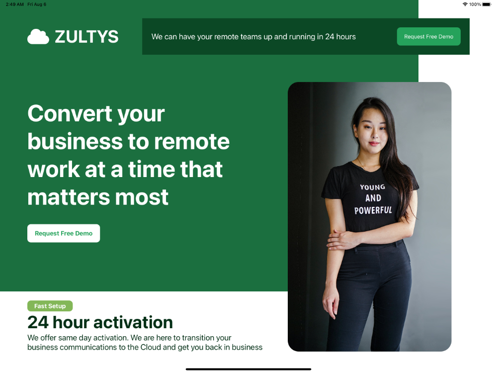
Front cover
Try this example on an iPad or tablet.
<Alloy>
  <Window class="bg-white">
    <View class="bg-(#1B6F3F) w-(2300px) h-(1600px) ml-0 mt-0">
      <View class="mt-(100px) h-(200px) left-(150px) horizontal">
        <Label class="fas fa-cloud text-(48px) text-white" />
        <Label class="ml-(30px) text-(48px) h-(200px) font-bold text-white">ZULTYS</Label>
      </View>

      <View class="vertical left-(150px) w-(1300px)">
        <Label class="text-(64px) mt-(275px) font-bold text-white">Convert your business to remote work at a time that matters most</Label>
        <Button class="mt-(75px) bg-(#fff) text-(#25A25B) h-(100px) w-(400px) rounded-(20px) left-(0) font-bold">Request Free Demo</Button>
      </View>
    </View>

    <View class="mt-(100px) mr-(150px) w-(1800px) h-(200px) bg-(#0B4825)">
      <Label class="left-(50px) text-(22px) font-normal text-white">We can have your remote teams up and running in 24 hours</Label>
      <Button class="bg-(#25A25B) h-(100px) w-(350px) rounded-(20px) right-(50px) text-white">Request Free Demo</Button>
    </View>

    <View class="mt-(450px) right-(250px) rounded-(60px)">
      <ImageView class="h-(1480px) w-(900px)" image="https://images.pexels.com/photos/1526814/pexels-photo-1526814.jpeg?auto=compress&cs=tinysrgb&dpr=3&h=1480&w=900&fit=crop" />
    </View>

    <View class="left-(150px) top-(1650px) vertical w-(1300px)">
      <Button class="left-(0) bg-(#83B758) h-(60px) w-(250px) rounded-(20px) font-bold text-white">Fast Setup</Button>
      <Label class="left-(0) text-(#042F16) text-(48px) font-bold">24 hour activation</Label>
      <Label class="left-(0) text-(#042F16) text-(22px) font-normal">We offer same day activation. We are here to transition your business communications to the Cloud and get you back in business</Label>
    </View>
  </Window>
</Alloy>
// PurgeTSS v7.10.2
// Created by César Estrada
// https://purgetss.com

// Ti Elements
'ImageView[platform=ios]': { hires: true }
'View': { width: Ti.UI.SIZE, height: Ti.UI.SIZE }
'Window': { backgroundColor: '#FFFFFF' }

// Main Styles
'.bg-white': { backgroundColor: '#ffffff' }
'.font-bold': { font: { fontWeight: 'bold' } }
'.font-normal': { font: { fontWeight: 'normal' } }
'.horizontal': { layout: 'horizontal' }
'.ml-0': { left: 0 }
'.mt-0': { top: 0 }
'.running': { running: true }
'.text-white': { color: '#ffffff', textColor: '#ffffff' }
'.vertical': { layout: 'vertical' }

// Arbitrary Values
'.bg-(#0B4825)': { backgroundColor: '#0B4825' }
'.bg-(#1B6F3F)': { backgroundColor: '#1B6F3F' }
'.bg-(#25A25B)': { backgroundColor: '#25A25B' }
'.bg-(#83B758)': { backgroundColor: '#83B758' }
'.bg-(#fff)': { backgroundColor: '#ffffff' }
'.h-(100px)': { height: '100px' }
'.h-(1480px)': { height: '1480px' }
'.h-(1600px)': { height: '1600px' }
'.h-(200px)': { height: '200px' }
'.h-(60px)': { height: '60px' }
'.left-(0)': { left: 0 }
'.left-(150px)': { left: '150px' }
'.left-(50px)': { left: '50px' }
'.ml-(30px)': { left: '30px' }
'.mr-(150px)': { right: '150px' }
'.mt-(100px)': { top: '100px' }
'.mt-(275px)': { top: '275px' }
'.mt-(450px)': { top: '450px' }
'.mt-(75px)': { top: '75px' }
'.right-(250px)': { right: '250px' }
'.right-(50px)': { right: '50px' }
'.rounded-(20px)': { borderRadius: '20px' }
'.rounded-(60px)': { borderRadius: '60px' }
'.text-(#042F16)': { color: '#042F16', textColor: '#042F16' }
'.text-(#25A25B)': { color: '#25A25B', textColor: '#25A25B' }
'.text-(22px)': { font: { fontSize: '22px' } }
'.text-(48px)': { font: { fontSize: '48px' } }
'.text-(64px)': { font: { fontSize: '64px' } }
'.top-(1650px)': { top: '1650px' }
'.w-(1300px)': { width: '1300px' }
'.w-(1800px)': { width: '1800px' }
'.w-(2300px)': { width: '2300px' }
'.w-(250px)': { width: '250px' }
'.w-(350px)': { width: '350px' }
'.w-(400px)': { width: '400px' }
'.w-(900px)': { width: '900px' }

// Default Font Awesome
'.fa-cloud': { text: '\uf0c2', title: '\uf0c2' }
'.fas': { font: { fontFamily: 'FontAwesome7Free-Solid' } }
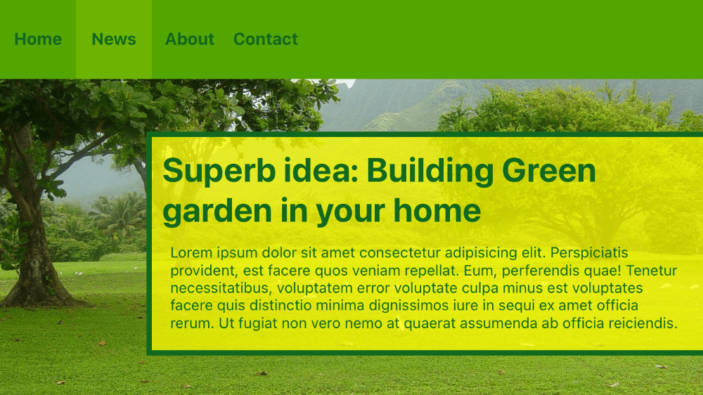
Menu bar
<Alloy>
  <Window class="bg-(#53606b)" backgroundImage="https://i.pinimg.com/originals/ab/70/a1/ab70a19f087cc9ba2b03e3bee71acc3e.jpg">
    <View class="h-(150px) bg-(#53A500) horizontal mt-0 w-full">
      <Label class="w-(4.5rem) text-(16px) h-(150px) text-(#12681E) text-center font-bold" text="Home" />
      <Label class="w-(4.5rem) text-(16px) h-(150px) text-(#12681E) bg-(#6DB400) text-center font-bold" text="News" />
      <Label class="w-(4.5rem) text-(16px) h-(150px) text-(#12681E) text-center font-bold" text="About" />
      <Label class="w-(4.5rem) text-(16px) h-(150px) text-(#12681E) text-center font-bold" text="Contact" />
    </View>

    <View class="bg-(rgba(255,255,0,0.75)) -right-(10px) top-(250px) bottom-(75px) w-(80%) border-(5) border-(#12681E) h-screen">
      <View class="m-(1rem) vertical h-screen w-screen">
        <Label class="text-(32px) text-(#12681E) font-bold" text="Superb idea: Building Green garden in your home" />
        <TextArea class="text-(14px) text-(#12681E) mt-1 bg-transparent">Lorem ipsum dolor sit amet consectetur adipisicing elit. Perspiciatis provident, est facere quos veniam repellat. Eum, perferendis quae! Tenetur necessitatibus, voluptatem error voluptate culpa minus est voluptates facere quis distinctio minima dignissimos iure in sequi ex amet officia rerum. Ut fugiat non vero nemo at quaerat assumenda ab officia reiciendis.</TextArea>
      </View>
    </View>
  </Window>
</Alloy>
// PurgeTSS v7.10.2
// Created by César Estrada
// https://purgetss.com

/* Ti Elements */
'View': { width: Ti.UI.SIZE, height: Ti.UI.SIZE }
'Window': { backgroundColor: '#FFFFFF' }

/* Main Styles */
'.bg-transparent': { backgroundColor: 'transparent' }
'.font-bold': { font: { fontWeight: 'bold' } }
'.h-screen': { height: Ti.UI.FILL }
'.horizontal': { layout: 'horizontal' }
'.mt-0': { top: 0 }
'.mt-1': { top: 4 }
'.text-center': { textAlign: Ti.UI.TEXT_ALIGNMENT_CENTER }
'.vertical': { layout: 'vertical' }
'.w-full': { width: '100%' }
'.w-screen': { width: Ti.UI.FILL }

/* Arbitrary Values */
'.-right-(10px)': { right: '-10px' }
'.bg-(#53606b)': { backgroundColor: '#53606b' }
'.bg-(#53A500)': { backgroundColor: '#53A500' }
'.bg-(#6DB400)': { backgroundColor: '#6DB400' }
'.bg-(rgba(255,255,0,0.75))': { backgroundColor: 'rgba(255,255,0,0.75)' }
'.border-(#12681E)': { borderColor: '#12681E' }
'.border-(5)': { borderWidth: 5 }
'.bottom-(75px)': { bottom: '75px' }
'.h-(150px)': { height: '150px' }
'.m-(1rem)': { top: 16, right: 16, bottom: 16, left: 16 }
'.text-(#12681E)': { color: '#12681E', textColor: '#12681E' }
'.text-(14px)': { font: { fontSize: '14px' } }
'.text-(16px)': { font: { fontSize: '16px' } }
'.text-(32px)': { font: { fontSize: '32px' } }
'.top-(250px)': { top: '250px' }
'.w-(4.5rem)': { width: 72 }
'.w-(80%)': { width: '80%' }
Generated screen