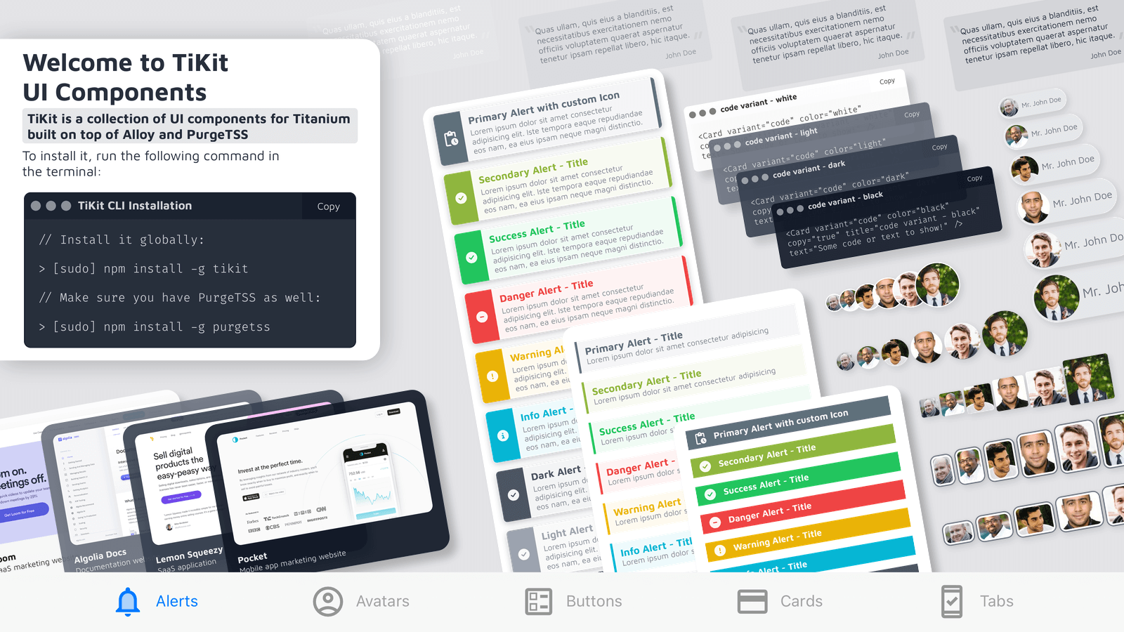
Welcome to TiKit UI Components


TiKit is a collection of UI components for Titanium SDK, built on top of Alloy and PurgeTSS.
Installation
To install it, run the following command in the terminal:
> [sudo] npm install -g tikit
Ensure that you also have PurgeTSS installed:
> [sudo] npm install -g purgetss
Installing the components
Once everything is installed on your machine, create a new Alloy project using PurgeTSS. Ensure that you have the app.idprefix and app.workspace settings configured.
> purgetss create myApp
Next, run tikit install and follow the interactive selection prompt:
> tikit install
? Choose a component to install › - Use arrow-keys. Return to submit.
❯   all components
    alerts
    avatars
    buttons
    cards
Available components and their variants
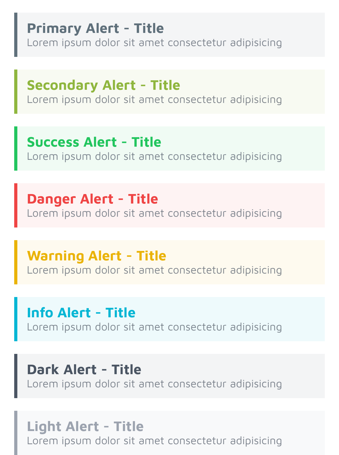
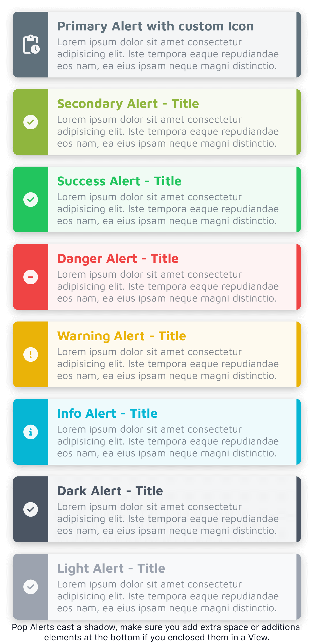
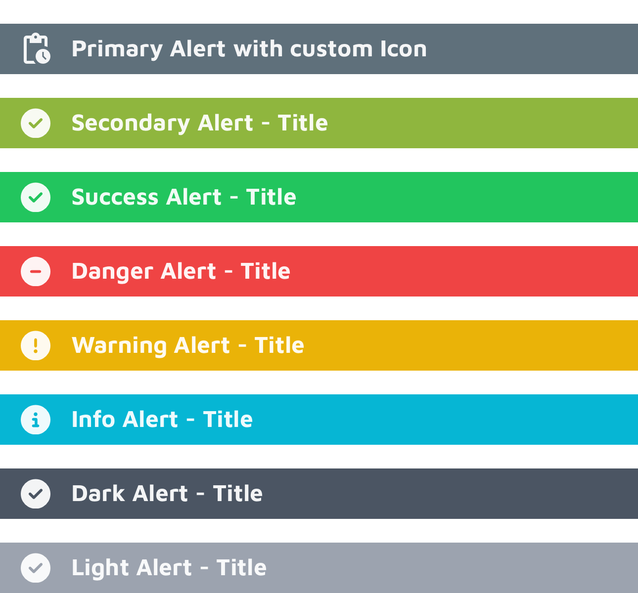
Alerts
General properties: variant, color, and classes
An alert is designed to display a concise and crucial message, capturing the user's attention without disrupting their ongoing task.
The TiKit Alert Component includes three variants:
- callout
- pop
- solid
Each of these variants comes in six primary colors: success, danger, warning, info, dark, and light.
Additionally, there are two custom colors available for each variant, named primary and secondary.
You can introduce your custom color values using the shades command in PurgeTSS:
> purgetss shades '#hexcode1' primary
> purgetss shades '#hexcode2' secondary
Additional properties: delay, duration, and dismissible
Use the delay property to specify when the alert should appear after a specified time, and the duration property to control the speed of the animation. Both of these properties are measured in milliseconds.
Set the dismissible property to true if you want the alert to close when the user clicks or taps on it.
<Alert module="tikit.ui" variant="pop" color="info" delay="500" dismissible="true" title="Dismissible Alert" text="Lorem ipsum dolor sit..." />
'callout'
Properties: title and text
This represents a simple alert with a title and a concise description.
<Alert module="tikit.ui" variant="callout" color="success" title="Callout variant" text="Lorem ipsum dolor sit..." />
'pop'
Properties: title, text, and icon
The "pop" variant of alerts is designed to include a predefined icon that highlights the message.
You can employ icon fonts like FontAwesome, Material Icons, or any other icon font of your preference.
Modify the icon by utilizing the icon property, and adjust its size using any of PurgeTSS's font size classes:
<Alert module="tikit.ui" variant="pop" color="primary" title="Primary Alert with custom Icon" text="Lorem ipsum dolor sit..." icon="mi mi-pending_actions text-3xl" />
'solid'
Properties: title and icon
The "solid" variant represents a full-width, solid banner that includes a title and a predefined icon.
Similar to the pop variant, you can customize its icon using the icon property and adjust its size by utilizing any of PurgeTSS's font size classes.
<Alert module="tikit.ui" variant="solid" color="primary" title="Primary Alert with custom Icon" icon="mi mi-pending_actions text-2xl" />
Avatars
General properties: variant, size, and classes
Avatars are a useful tool for representing people or objects and can serve as visual identifiers for user profiles within your app.
The TiKit Avatar Component offers six variants:
- chip
- circular
- landscape
- portrait
- square
- stacked
Each variant comes in six different sizes: xs, sm, base, lg, xl and 2xl.
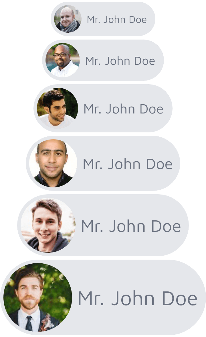
<Avatar module="tikit.ui" variant="chip" size="base" name="John Doe" image="link-to-image.jpg" />
'chip'
Properties: name and image
The "chip" variant allows you to specify the name of the person and an image to display. You can use a local filesystem path, a remote URL, or a Blob object containing image data.
By default, the colors for the "chip" variant are set to bg-gray-200 and text-gray-500. If you wish to change these colors, you can do so using the classes property, as demonstrated in the example below.
<Avatar module="tikit.ui" variant="chip" size="base" name="Mr. John Doe" image="https://randomuser.me/api/portraits/men/86.jpg" classes="bg-violet-900 text-violet-50" />
'circular'
Properties: name, image, and border
For the "circular" variant, you can specify the name, image, and whether to display a white border around the image. Set the border property to true to show the white border.
To further customize the border color, you can utilize the classes property.
<Avatar module="tikit.ui" variant="circular" size="base" border="true" image="https://randomuser.me/api/portraits/men/86.jpg" />

'square'
Properties: name, image, and border
In the "square" variant, you can define the name, image, and choose whether to display a white border around the image. To enable the white border, set the border property to true.
For additional control over the border color, you can make use of the classes property.
<Avatar module="tikit.ui" variant="square" size="base" border="true" classes="border-violet-900" image="https://randomuser.me/api/portraits/men/86.jpg" />

'portrait'
Properties: name and image
The "portrait" variant allows you to specify the name and image. To customize the border color, utilize the classes property.
By default, the border color is set to border-gray-500. To change this color, you can make use of the classes property.
<Avatar module="tikit.ui" variant="portrait" size="base" classes="border-violet-900" image="https://randomuser.me/api/portraits/men/86.jpg" />

'landscape'
Properties: name and image
The "landscape" variant permits you to define the name and image. If you want to modify the border color, you can do so using the classes property.
By default, the border color is set to border-gray-500. To alter this color, utilize the classes property.
<Avatar module="tikit.ui" variant="landscape" size="base" classes="border-violet-900" image="https://randomuser.me/api/portraits/men/86.jpg" />

'stacked'
Properties: title, icon, and last
In the "stacked" variant, you can specify the title, icon, and use the last property to properly adjust the right margin of the last avatar in a stack. Setting last to true for the last avatar ensures the appropriate right margin.
<View class="horizontal">
  <Avatar module="tikit.ui" variant="stacked" size="base" image="https://randomuser.me/api/portraits/men/86.jpg" />
  <Avatar module="tikit.ui" variant="stacked" size="base" image="https://randomuser.me/api/portraits/men/87.jpg" />
  <Avatar module="tikit.ui" variant="stacked" size="base" image="https://randomuser.me/api/portraits/men/62.jpg" />
  <Avatar module="tikit.ui" variant="stacked" size="base" last="true" image="https://randomuser.me/api/portraits/men/88.jpg" />
</View>

Buttons
General properties: variant, size, and classes
Buttons are interactive elements that enable users to take actions or make choices.
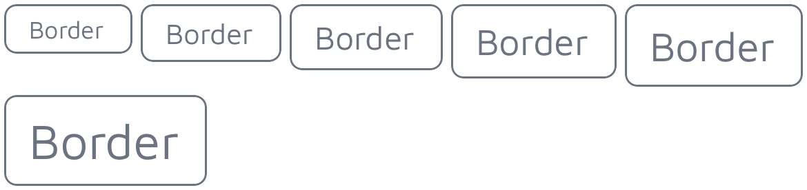
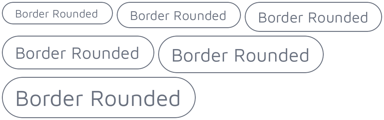
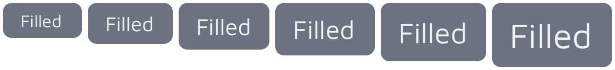
The TiKit Button Component offers six variants:
- border
- border-rounded
- filled
- filled-rounded
- icon-left
- icon-right
Each variant is available in six different sizes: xs, sm, base, lg, xl and 2xl.
<Button module="tikit.ui" variant="border" size="lg" title="Button Name" />
'border'
Property: title
For the "border" variant, you can set the title. To change the color of the title and border, utilize the classes property.
<Button module="tikit.ui" variant="border" size="base" title="Border" classes="border-violet-900 text-violet-900" />
Border-Rounded
Property: title
In the "border-rounded" variant, you can specify the title. To customize the color of both the title and border, make use of the classes property.
<Button module="tikit.ui" variant="border-rounded" size="base" title="Border Rounded" classes="border-violet-900 text-violet-900" />
'filled'
Property: title
For the "filled" variant, you can set the title. To modify the color of both the title and the background, utilize the classes property.
<Button module="tikit.ui" variant="filled" size="base" title="Filled" classes="text-violet-50 bg-violet-900" />
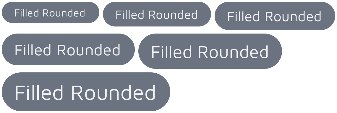
'filled-rounded'
Property: title
In the "filled-rounded" variant, you can specify the title. To customize the color of both the title and background, make use of the classes property.
<Button module="tikit.ui" variant="filled-rounded" size="base" title="Filled Rounded" classes="text-violet-50 bg-violet-900" />
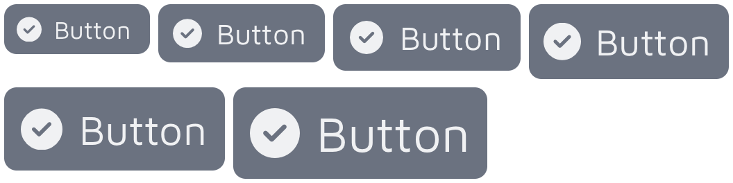
'icon-left'
Properties: title and icon
For the "icon-left" variant, you can set the title and use the icon property to change its icon, color, and size.
Additionally, you can modify the color of the title and background by using the classes property.
<Button module="tikit.ui" variant="icon-left" size="base" title="Button" icon="fa fa-file text-violet-50" classes="text-violet-50 bg-violet-900" />
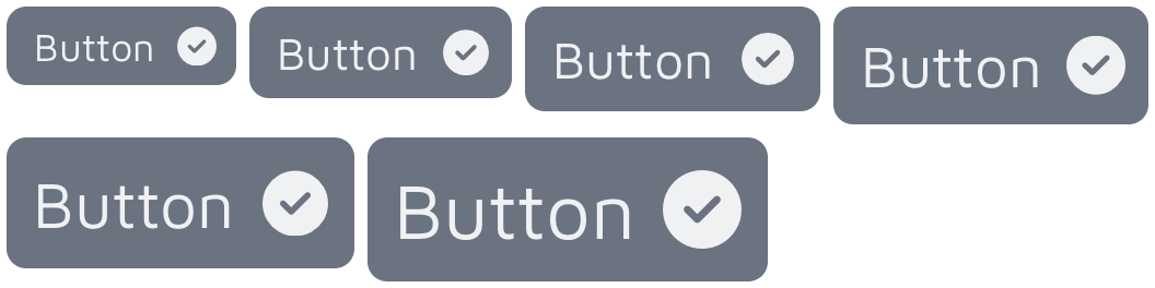
'icon-right'
Properties: title and icon
In the "icon-right" variant, you can specify the title and utilize the icon property to adjust its icon, color, and size.
For further customization, such as changing the color of the title and background, utilize the classes property.
<Button module="tikit.ui" variant="icon-right" size="base" title="Button" icon="fa fa-file text-violet-50" classes="text-violet-50 bg-violet-900" />
Custom Icons
Use any Icon Font Library
You have the flexibility to switch to a different icon from the FontAwesome Icon Library or even opt for a different font vendor. You can achieve this by setting the icon property with the appropriate font and icon classes, like fa fa-file-pdf or mi mi-pending_actions.
Furthermore, you can adjust the icon's size using any of PurgeTSS's font size classes, such as text-lg or text-2xl.
In the following example, we demonstrate the use of the Material Icons font library.
<Button module="tikit.ui" variant="icon-left" size="base" icon="mi mi-pending_actions text-2xl text-violet-50" title="Pending Actions" classes="my-4 font-bold bg-violet-900" />

Cards
General properties: variant, color, and classes
Cards are a valuable tool for grouping and presenting content in a readable manner, often serving as an introduction to more comprehensive information.
The TiKit Card Component offers four variants:
- code
- content
- quote
- showcase
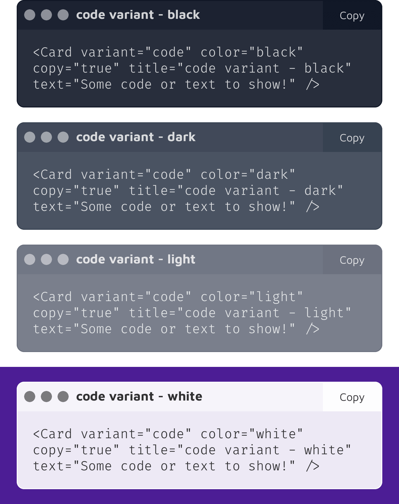
Each variant is available in four different colors: black, dark, light, and white.
<Card module="tikit.ui" variant="code" color="black" copy="true" title="Card Title" text="Some code or text to display!" />
'code'
Properties: title, text, and copy
The "code" variant is specifically designed for displaying small snippets of code.
You can employ the copy property to include a copy button at the top-right corner. The button's title and the alert message are set using Titanium's localization function: L('copy', 'Copy') and L('code_copied', 'Code copied to clipboard!'), respectively. To personalize and translate these strings, add both "copy" and "code_copied" to your app's target languages (e.g., app/i18n/xx/strings.xml).
To enhance the appearance of your code snippets, install a monotype font family of your choice and create a font-mono style in static/purgetss/config.js. In all our examples, we utilize the FiraCode-Light font family.
'showcase'
Properties: title, text, and image
The "showcase" variant is intended for scenarios where you want to showcase an image alongside a title and a brief description. This variant is particularly useful when you need to present visual content with accompanying information.
<Card module="tikit.ui" variant="showcase" color="black" title="Pocket" text="Mobile app marketing website" image="images/showcase/1.png" />

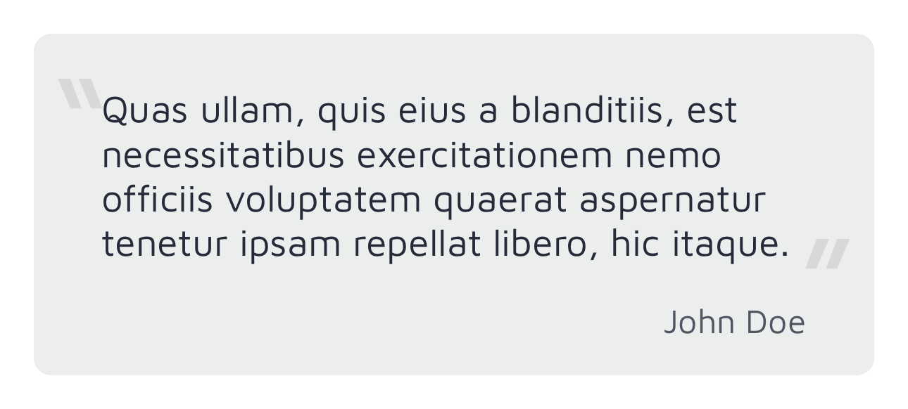
'quote'
Properties: name and text
The "quote" variant is designed for situations where you want to display a quotation from someone. This variant allows you to attribute the quote to its source by specifying the name of the person or entity and the text of the quote itself. It's an effective way to showcase quotes within your content.
<Card module="tikit.ui" variant="quote" color="black" name="John Doe" text="Quas ullam, quis eius a blanditiis..." />
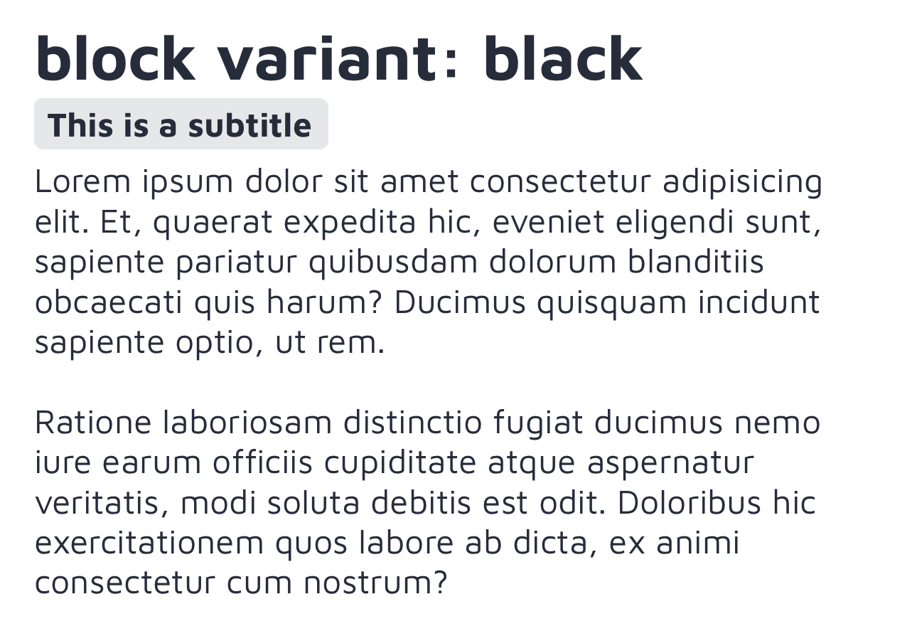
'content'
Properties: title, subtitle, and text.
The "content" variant is suitable for presenting a block of text content with the following features:
- A large title
- A highlighted subtitle
- Paragraphs of text
This variant is ideal for displaying textual information where you want to emphasize the title and subtitle while providing detailed content in paragraphs.
<Card module="tikit.ui" variant="content" color="black" title="content variant, black" subtitle="This is a subtitle" text="Alloy.Globals.lorem" />
Tabs
The Tab component provides an instance of Titanium.UI.Tab, featuring a custom icon created using an icon font, such as FontAwesome, Material Icons, or any other font of your preference.
By configuring the title, icon, and activeIcon (iOS only) properties, you can create a Tab component with well-rendered icons.
The icon property combines the icon font name and the icon code, like fa fa-home or mi mi-home.
<Tab module="tikit.ui" title="Email" icon="far fa-envelope" activeIcon="fas fa-envelope">
  <!-- tab’s-window-content -->
</Tab>
Additional properties
These are standard Titanium.UI.Tab objects, so you can utilize all the properties and methods available for them.
For instance, you can set the active tint and title color for each tab using the activeTintColor and activeTitleColor properties, as demonstrated below:
<Tab module="tikit.ui" class="active-tint-violet-900 active-title-violet-900" title="Tabs" icon="mio mi-security_update_good text-3xl" activeIcon="mit mi-security_update_good text-3xl">
  <Require src="sections/tabs" />
</Tab>
Official Icon Fonts in PurgeTSS
To incorporate the free versions of Font Awesome, Material Icons, Material Symbols, or Framework7 Icons into your project, you can use the icon-library command in PurgeTSS:
> purgetss icon-library --vendor=fa,mi,ms,f7
Here's what each vendor abbreviation stands for:
faorfontawesomerepresents Font Awesome Icons.miormaterialiconsstands for Material Icons.msormaterialsymbolcorresponds to Material Symbols.f7orframework7is used for Framework7 Icons.
Running this command allows you to conveniently copy these icon font libraries into your project for use in your UI components.